We all have different opinions of what makes a good or bad website. Like anything else it boils down to personnel preference. For me the function has to come before form the majority of the time. Our site has used an older WordPress theme since it was created and while it has served us there are things that we would like to do now that other themes might work better for.
So how do you go about revamping a working site? For me it was all about finding inspiration sites. What websites do I like? Why do I like them? Then asking those same questions of others. Looking at their preferred sites and listening to what they liked about them. Then finding the common threads which boiled down to relatively few items:
- Easy to use navigation.
- Not having to drill down through 7 menus to try and find what it is you are looking for.
- Having things organized in such a way that you CAN find them without having to know where they already are. Example: Don’t put a pen turning article that required some unique tool just under shop tools. Instead put two articles that link to each other. The tool maybe under a review or a how to is you had to create it and the pen itself under turning and again in the gallery.
- Keep it easy for the reader. In the above example you might start by reading about the tool and then want to see what the turned product process was. If you put the links in each article it makes it easy for the reader to move from one to the other without having to go searching.
- Don’t get cute. In general sticking to expectations is best. We expect to find navigation in the top bar. We expect to find “extra” navigation items in a footer. We expect to find contact information, shopping carts, social media links in certain places. We also expect those items to behave in a certain manner. If we hoover over something we expect certain things to happen.
- Don’t expect people to know what you did and how it works. If you have a top level navigation item which has sub menu options make sure that you identify that the menus go deeper. It can be as simple as a little arrow head to the right of the sub menu option.
- Endless Scrolling.
- For sites like Facebook, Youtube, Amazon we all kind of expect this. You can do searches to limit it or you can just spend a day endlessly flicking your mouse wheel and letting the choices unfurl before your wondering eyes. When I am looking at a site like ours I don’t want the home page to scroll into infinity to make me find things. This goes back to having good navigation.
- Colors, fonts, and layout that are easy to read.
- I’m old. My eyes tend to get strained easier than they did in their 20’s. So a background and font type that help to reduce that strain are important to me. I find that a slightly off white background with a darker, preferably shade of black, font color are the easiest on me. While this might not be as appealing to every age group it also does not hurt any age group.
- Have an understanding of the color wheel. Colors can harmonize or jar depending on where they sit on the wheel from each other. There can be places for both you can create a site with colors that have a feeling of harmony but maybe on a post about the dangers of process or tool you might want to use those pallets that are jarring. But overall pick a theme and go with it.
- Consistency.
- This is probably one of the most aggravating issues for me. If each post or page feels like it’s own little mini website or company you loose your brand. Sure pictures are great and we love them. Changing the banner photo on every page might not be great. Changing the theme, font, colors can be just enough to make readers feel uneasy.
- Keep all your navigation the same on every page. You might have a sub navigation menu of a page but that does not mean that the main navigation menu should be totally gone. This makes things easier on you too. If you have to make a change you make it once and everything gets updated.
We have and continue to do things that we ourselves are not okay with. In part that comes from having a theme and site that has been up for years. We are working with the parameters we have. That being said here is what we have been doing behind the scenes, testing different themes, testing different editing tools and add ons, upping our photography skills, working on producing videos that go with the written articles, contemplating adding a store, and offering design classes and services. Most of this is taking place behind the scenes and on test servers. The first big change was picking a new theme and upgrading to it. Let’s just say that was ugly.
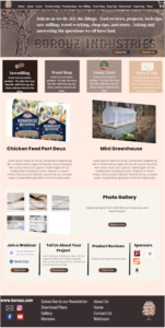
How has the process been going? Slowly. Here is a mock up of design, layout, content for the homepage that was put together with Canva.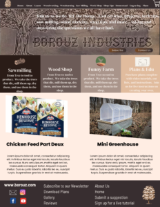
Note the heading bar: There is a mistake here the little maple tree logo does not have our name, Borouz. Guess what we are not Amazon our little tree does not have wide spread brand recognition, we need to have the company name here. The list of navigation items might be to long that still needs some tuning. People do expect if you have a store to see the cart somewhere up here.
The next section has the banner picture, the company name, and a little blub about who we are. Along with two little call to action buttons. A way to subscribe or contact you in this area is also something that people expect and you want to make it easy for them.
The next space is still in the works. We like the idea of having the most recent posts or things that we definitely do not want you to miss on the home page. That will probably remain the same but perhaps expand to be potentially the last 5 – 10 posts.
The four boxes between the hero section and the current posts is new. Ideally this would be an opportunity to let people know in general terms the kinds of things to expect on the site. The way to break it down, pictures (if any) to use, and how best to describe what we are all about is a process.
The footer is important. There are some key points here to include: The company info such as website address, social media links, email link, phone number and address are all important. Yes, I know our phone number and address are not here and that is intentional, at this time, and it might be the same for you. After all if your not a company that has a physical location for people to come to or a need for people to contact you via the phone then you would not post that. Balancing the left and the right using the little maple tree logo was good BUT again no company name on the tree is bad. Putting links to make things easier for people and because this is where we might expect to find them is smart.
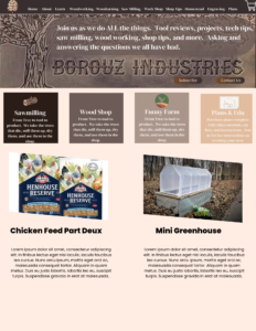
Here it is after a few more changes.
 |
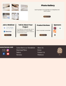 |
Spacing has been changed so that it doesn’t feel as heavy. The additional “white” space gives the eye more places to rest. Decisions are still being made as to what to include on that main page but the idea is to have newer content but also the addition of things like the photo gallery links, classes that might be available to join along with the signup forms, a place for the community to share their projects or engage us to help offer design services, an easy way to find product reviews and also a way to easily let you know who we are affiliated with. (Currently titled Sponsors because I am an optimist and while these people don’t even know we exist I am hopeful.)
Canva was used because I have experience with it. That made it easier and quicker for me to create in. Having the ability to add pictures, colors, fonts, made it easier for the group to understand the idea. This is something that you can be creative with depending on what is easiest for you to use. You don’t need a program you can just sketch it up with a pencil and paper. The most important thing is have a plan.
There are issues with Canva as you can see above. I created a document which meant that as it got bigger I was adding pages which means it views funny.
When I presented the changes to the group I created a single png file so that they were able to have a better sense of what the webpage would be like without the distraction of seeing it as two separate pages. I used GIMP, brought in both png’s and cropped the second one to eliminate the blank space under the footer. Created a new image with the longer size and copied and pasted both top and bottom into the new one. There might be a better way to do this but I’m using what I know and making it work. Learning as I go but using what I know. At the end of the day it’s not about how ugly it was getting there it’s that you got there.
Another fix on this mock up was that the text in the top part the team felt was hard to read. By increasing the opacity of the background behind the text it became more readable.
The process of working out what the design should be and how the menus and layouts should work is ongoing. The decision to use a tool like Canva to do the design mockups rather than building webpages was made because it’s easier to quickly create these types of visuals. Once the design and layout decisions are made then it’s time to figure out how to do this in WordPress. This should make it easier to figure out which theme will be the best bone set to work from. It will also help to figure out what add ons will be needed, such as webstore tools, email engines, social media tools, and editing tools.
We have found the following site helpful in learning the concepts of good and bad web development. https://thewebsitearchitect.com/ specifically the video series on the Youtube channel https://thewebsitearchitect.com/learn/
As for editing tools on WordPress the current theme has a more limited tool set and doing certain things like adding footers is not intuitive. Looking at different themes the Elementor editing tool was suggested. Trying it with that theme it seems like a good answer but it to was not intuitive. It had enough potential power to make it worth learning how to use it. To get comfortable with the tools and how they are used and what they do I used the How To Build a Website With Elementor [WordPress Course] https://www.youtube.com/watch?v=icTcREd1tAg&list=PLZyp9H25CboE6dhe7MnUxUdp4zU7OsNSe&index=1
For you hands on learners, and I am among you, if you can create a site with the theme and tools they are using you will get the most out of this. We created a sandbox for me to play in on a virtual web server. WordPress was loaded, I installed the theme they were using and installed the Elementor editing tool. From there I just followed along with everything that was being done in the video. That meant a lot of pausing while I went through the steps just done. Which makes the process take longer and I won’t be using a lot of what I did because having the webpage scroll over the photos looks neat but it is one of those website design elements that I don’t like. It’s distracting and I don’t like having to scroll around to see the whole image but it does look cool when you are doing it just for the sake of doing it. I would also suggest looking for some photos to insert because they don’t include photos or text that they use. If you can gather that before you start it will make things faster. I have also had to pause the video and go find other sources to explain what was just done or how to do it. That could just be a me thing.
All the learning and creating has definitely eaten into the day to day content creation. Apologize on that. In the last two weeks we have also had a member who was doing a little bit of travel before starting college, a little bit of illness, finishing up the process of college enrollment, two birthdays and an anniversary, and a weekend when the “real job” took both days. In all that the projects kept on going we just were not posting about them. The printing on galvanized metal tags from the Dollar Tree is almost done just one more comparison print left to do. (Somebody else felt that they should get to use the laser and I lost my monopoly.) There was some play time with tweaking a garden stack design to get the best result on the laser. Posts on the pattern, the Lightburn settings, the file edits needed and what tools were used will be forthcoming. We have also been playing with creating foam chainmail there will be a post(s) on that including Adam Savage geeking out over the designer. Updated gallery photos of pens are coming along with some of the things that were are learning about product photography. New videos and a review of the video equipment and software are in the works. More turning projects from Wolf Studios are on the way. A miter saw repair video and how to is in the editing room. Along with, and I am pretty excited about this because it is seven years in the making, the Havel helmet how to. Plus lots and lots of misc projects like moving the sawmill, expanding the food forest, hatching some homegrown eggs, and building out the coffee bar area in the kitchen.
Stay tuned the best is yet to come.